I’ve been traveling somewhat during the last few years, and I wanted to check on a map which countries I already visited. There’s one requirement: I want the whole area of countries I’ve visited to be highlighted. There are a couple of solutions for that:
- The Elastic stack
-
Data can be stored in ElasticSearch, and there’s one world map visualization available for the Kibana dashboard. This works, but:
- The visualization handles geo-location, but no highlighting an entire country
- It requires some setup, and I’m a developer - read that I’m lazy.
- Dedicated app
-
To be honest, I didn’t search but I assume "there is an app for that". But by using a dedicated app, you’re not the owner of your own data anymore and that doesn’t suit me.
- Google Maps
-
Google Maps allows to add layers, and dedicated data. This solution would be a great fit, if it was possible to easily highlight countries. And still, there’s still a lot of JavaScript to write.
Come Google Fusion Tables.
| Fusion Tables is an experimental service offered by Google. |
Creating the table
While it’s possible to input the data directly into Fusion Tables, it’s easier to do that in a simple Google Spreadsheet. The following is sample data:
| Date | Country | Place | Type | Event |
|---|---|---|---|---|
2017/06 |
Denmark |
Copenhagen |
Conference |
JDK.io |
2017/06 |
Sweden |
Malmö |
Conference |
JKD.io |
2017/05 |
Ukraine |
Kiev |
Conference |
JEEConf |
2017/05 |
Greece |
Athens |
Conference |
Voxxed Days |
Such a spreadsheet can easily be imported into Fusion Tables.
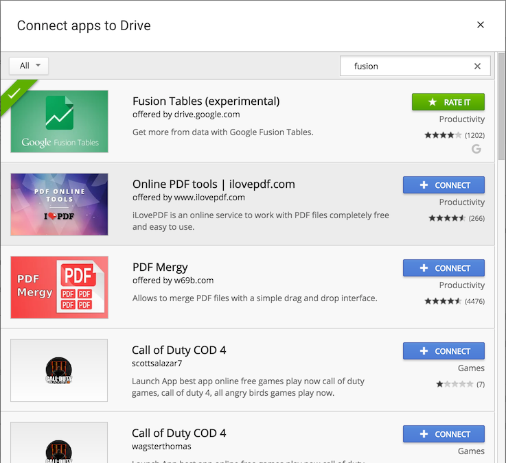
- Connect Fusion Tables on Google Drive. From the Drive’s homepage, go on .
Search for "fusion". Click on Connect.
- Create a new Fusion Tables document. From the Drive’s homepage, click on .
Then select Google Spreadsheet.
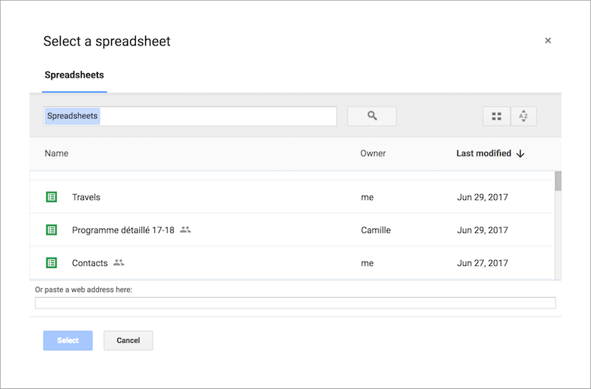
- Select the desired spreadsheet and click Select.
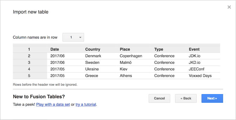
- Name the table accordingly and click Finish.
It yields something akin to the following:
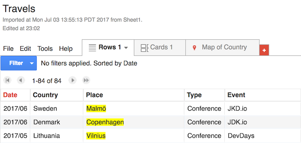
Out-of-the-box, there’s a Map of Country tab that displays each data line on a world map. Unfortunately, it’s a simple dot at the center of the country. It doesn’t fulfil the initial requirement of highlighting the entire country area.
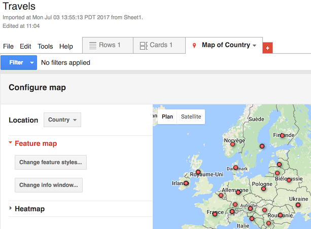
Changing the Location field to "Place" instead of "Country" will place dots at the correct location instead of the country center, but still no highlighting.
Merging multiple Fusion Tables
Fusion Tables support geometries that can be defined using the Keyhole Markup Language format. That can fulfil the highlighting requirement. Yet, that would mean defining the geometry of each country visited manually; it requires an effort I’m not prepared to make. Fortunately, it’s possible to "join" multiple tables - it’s called merging. Merging creates a new table, with both tables associated in it. Even better, if any of the initial table data changes, it’s reflected in the merged table.
Good news: there’s an existing publicly accessible table defining all country geographies. Let’s merge the existing table with it in . In the Or paste a web address here field, paste the URL from the world countries above. Click Next. The opening pop-up requires to define the "join" columns of the tables.
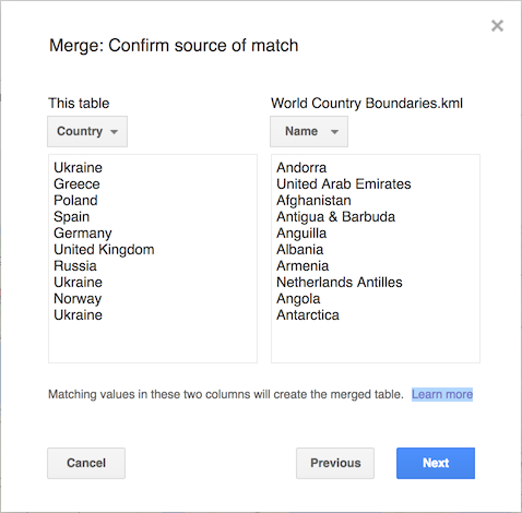
Click Next. In the opening pop-up, tick the checkboxes of columns that will be part of the merged table. Click Merge. Wait for the merge to happen. Click View table.
Now, on the world map tab, changing the Location field to "geometry" yields the expected result.
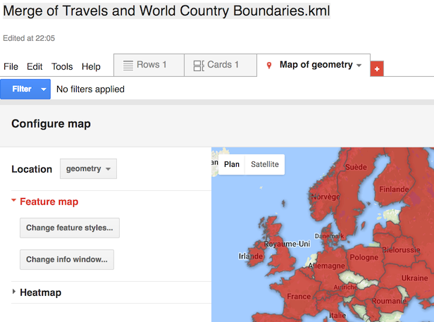
At this point, the requirement is fulfilled. Further refinements would be to access the data via its REST API.
Conclusion
Fusion Tables is a no-fluff, just-stuff cloud service that allows to easily display data in various ways. With its ability to join on other tables, it’s easy to re-use existing tabular data.

